

Colors in Design: What’s their importance?
News
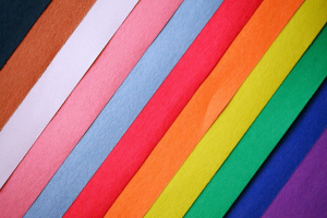
Color is present in our lives, every day and at every moment, in whatever direction we look. In addition to being fundamental in the day-to-day, it plays a very important role regarding design.
Colors are able to make us feel in different ways, express emotions or moods, alert us to dangers, pass on information about certain objects and even make us make decisions in our daily life, so in design, it is fundamental to understand the theory of colors so that we can draw users’ attention to a particular detail, to assign different meanings to things and pass messages more effectively, combining and using colors in a more conscious and harmonious way.
But what is color anyway?
Color is nothing more than a property of what we see when our eyes encounter light and other objects. In a summarized way, the color arises when the lightemits from the reaches an object and is absorbed and/or reflected back to our eyes. Light is emitted in wave form and when different wavelengths are absorbed by objects and reach our eyes, we see what we call color (each color has a different wavelength, for this reason we can distinguish different colors).
By understanding the basic principles of light and color, we can better understand how colors behave in different types of media, whether they are present in digital images, fingerprints, or any other type of media available.
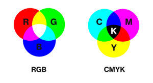
RGB vs CMYK
Although both are used in design, RGB color mode is the best to use when performing digital work, since mobile d-slides, monitors and televisions use this color mode (screen light source creates all colors by mixing red, blue, and green). However, when we talk about jobs that will be printed, such as business cards or flyers, CMYK becomes the most indicated color system, since printers use this color mode to print (printer mixes the colors cyan, magenta, yellow and black varying the different amounts of each ink).
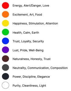
Colors and Meanings
Over the years we have been automatically assigning different meanings to colors and these meanings may be different depending on the country and culture. As we mentioned earlier, colors cantransmite different messages and feelings, so when a designer performs a job you should be aware that your choice of colors will affect how the user feels about what they see.
Most common meanings of colors:
Color Harmony
Sometimes we refer to colors as being hot or cold, this happens, because psychologically, we associate heat with colors such as yellow, orange, and red, and associate colors such as green, blue, or purple with cold.
In design, by using similar colors, we can create an image with uniform colors that match well with each other. Harmony of colors is then the balance that exists between the chosen colors.
There are numerous color harmonies that can be usedin design to make it visually more attractive and effective, the most common being:
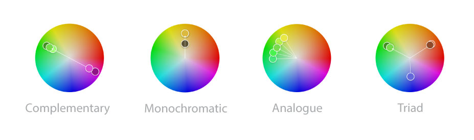
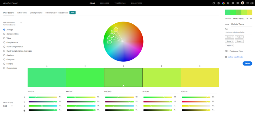
There are tools that make choosing colors easier, such as the color wheel, which helps us choose harmonies from a certain color. Just select the color and type of harmony you want. An excellent example of this ferramenta can be found online on the adobe color site.
So, we can conclude that before choosing colors, we should start by thinking about the message we want to convey. Once you set the purpose, it’s easier to choose a color combination that will help us convey the message more effectively.
