

Descrição do Projeto
Manemac
Branding
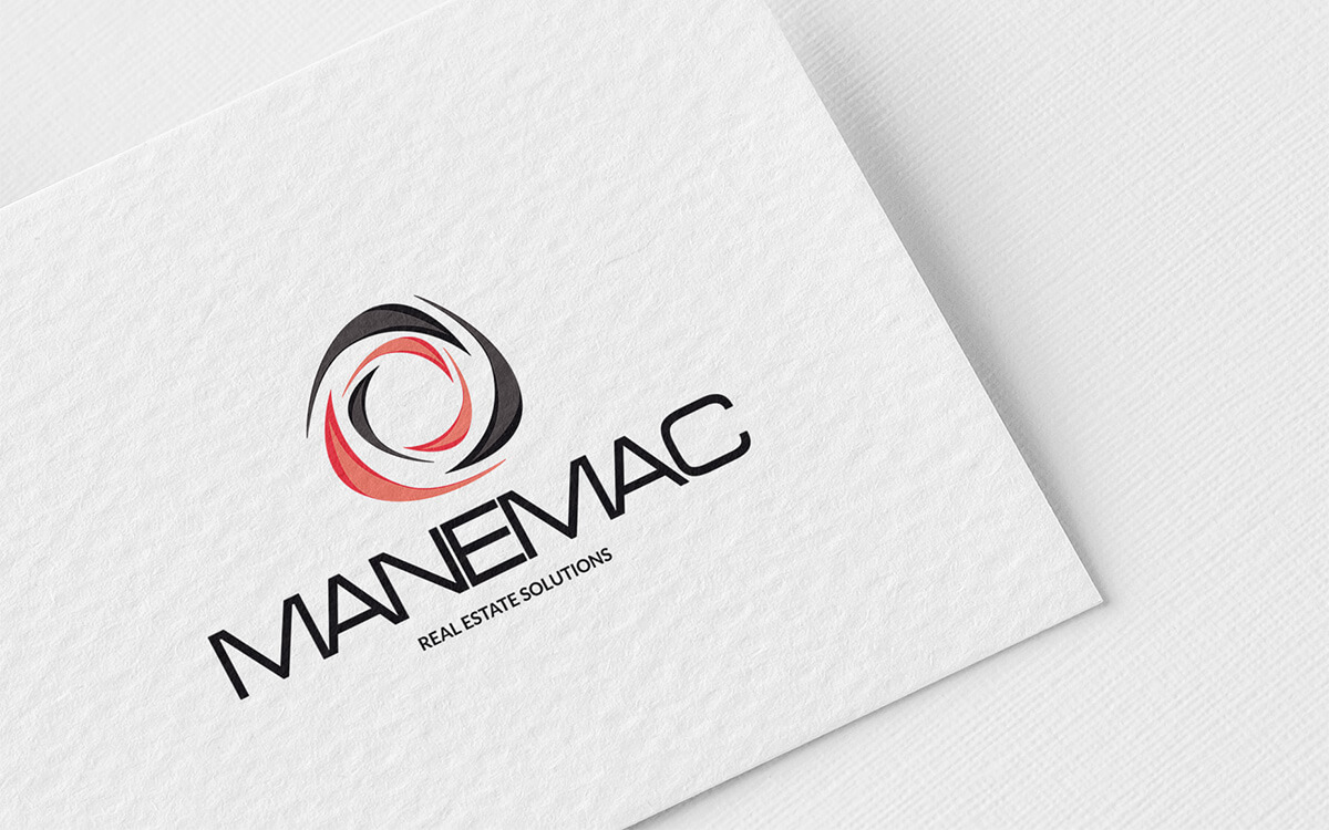
Manemac is a real estate company that intends to stand out from the others already in the market. One way to do this starts with the originality of the logo created by Goweb. The use of the colors red and black, in agreement with the client, gives him presence, distinction and character. Circles represent various dimensions of service, proactivity and perseverance in finding solutions for your customers.Info

Copyright © 2021  Since 2000
 Since 2000