

Descrição do Projeto
Playful Lust
Branding
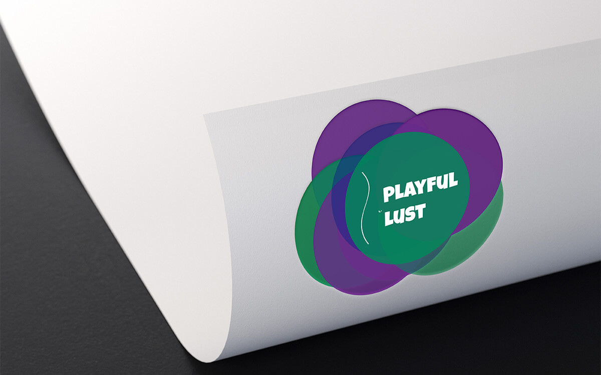
Playful Lust is an online store dedicated to the sale of a wide range of sexual products. The Playful Lust logo was developed based on essential information shared in collaboration with the customer and by creating a list of objectives that the logo design should meet. A sensual language was intended, insinuated in an unusual way. The logo should have class and good taste, without the use of graphic pieces alluding to fruit. The sensuality could be simulated using silhouettes of parts of the human body or circles and the concept to transmit through the graphics would be "Boudoir Naughty". As for the color palette, it is worth noting the customer's preference for the purple color and the use of black or red should be avoided because they are too much used in the business area in question. The purple color symbolizes the power of the imagination and this pertinent in the customers of the store, while the green color is a symbol of balance of mental, emotional and physical energies. In accordance with the customer's design goals, an illustration of a belly silhouette was drawn next to the name of the online store. The name "Playful Lust" is presented in a simple and clear way using a modern and fun font also symbolizing the products sold in the online store.Info

Copyright © 2021  Since 2000
 Since 2000