

Descrição do Projeto
Lovely disabled
Branding
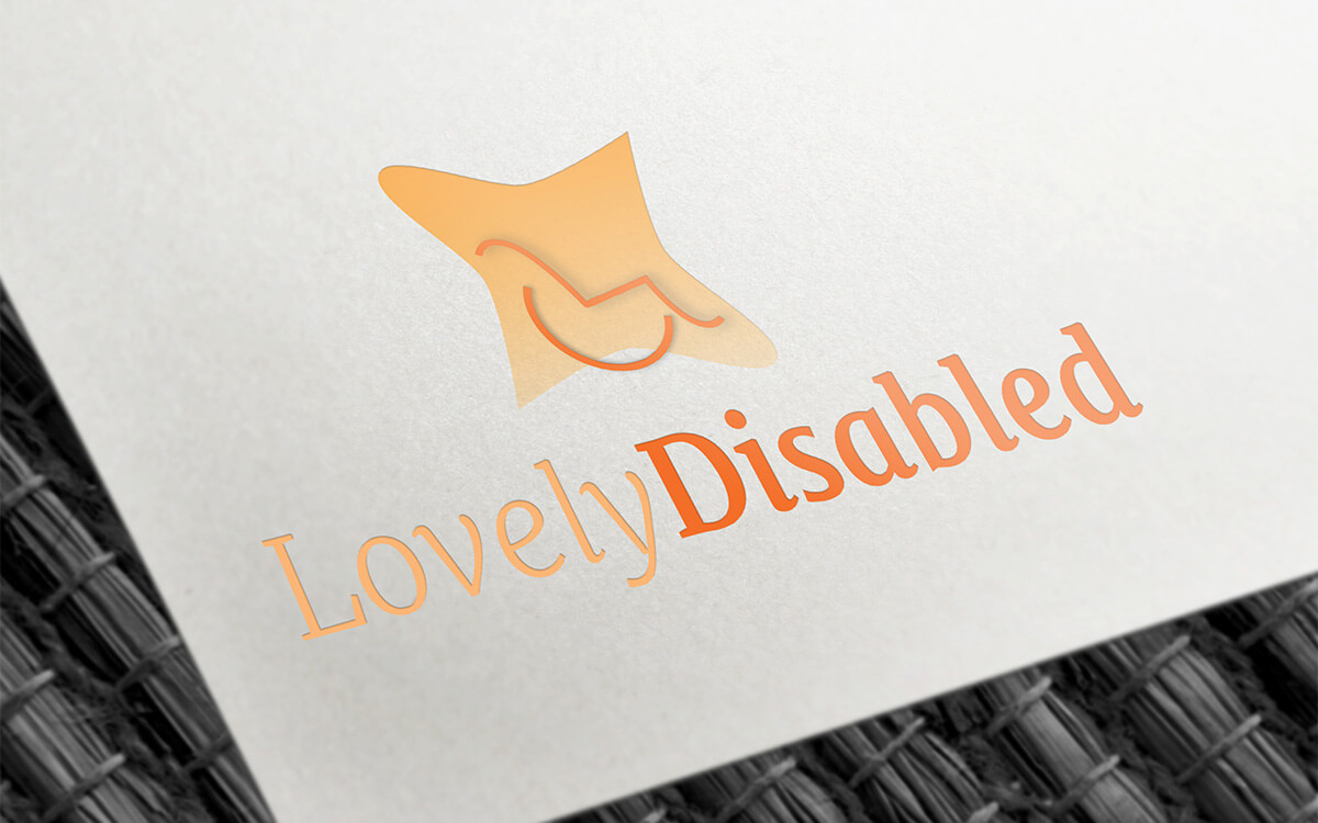
Lovely Disabled is a Relationship Platform between people with disabilities. The Lovely Disabled logo was developed based on essential information shared in collaboration with the customer and by creating a list of objectives that the logo design should meet. A logo consisting of a graphic design and simple lettering was intended. This would depend on the simplicity or not of the graphic piece applied to the logo. If the graphic piece was simple the lettering could be more worked, however if the graphic piece was more worked and had more information the lettering should be simpler. As for the color palette, it is worth noting the customer's preference for warm colors such as orange and yellow, symbolizing the concept of socializing and communicating. However, it was possible to opt for more pastel tones. In accordance with the client's design goals, an illustration of a silhouette of an orange wheelchair was drawn. The name "Lovely Disabled" is clearly presented using a serif font.Info

Copyright © 2021  Since 2000
 Since 2000