

Descrição do Projeto
Gaiafor
Branding
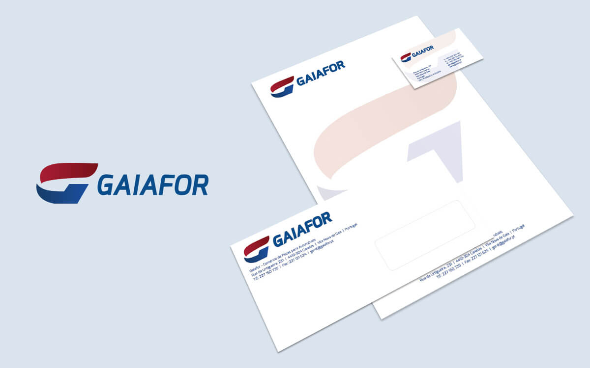
Gaiafor has been selling car parts for 29 years. Initially it commercialized exclusively Ford parts, later it started to commercialize other brands. The Gaiafor logo was developed on the basis of essential information shared in collaboration with the customer and by creating a list of objectives that the logo design should meet. A "G" symbol with the name "Gaiafor" was desired. As for the colour palette, it is worth noting the preference for red and blue. In accordance with the client's design objectives, a modern symbol based on the letter "G" was designed together with the lettering "Gaiafor", thus creating a uniform mark to be applied in stationary.Info

Copyright © 2021  Since 2000
 Since 2000